Author: Karen Kim
Pandemic times are strange indeed.
Use cases have changed left and right- most of us are working from home.
Many companies scrambled for the 100% remote lifestyle, facing growing pains and even operational existential crises. How could traditionally on-the-ground product teams connect away from brick and mortar (or glass) huddle rooms?
With a surge in digital connectivity and workspace platforms to tackle COVID-19, we’re moving towards a new reality where physical meeting spaces are nice-to-have rather than necessities for planning meetings and stand-ups.
The new bread and butter for Product Managers working remotely?
Zoom meetings.
Zoom started out in 2012, releasing a beta that hosted conferences of up to 15 video participants. Launching in 2013, Zoom wrapped up its first month with 400,000 users, jumping to 1 million by its third. Then COVID happened. On one day in March 2020, Zoom was downloaded 2.13 million times, and a month later, Zoom had more than 300 million daily active users. Under shuttered offices and quarantine, Zoom became THE video conferencing tool that took the spotlight in this socially distanced workflow.
Zoom’s become the easy-to-use tool for virtual meetings, from industry webinars to business meetings to a star-studded virtual live read of The Princess Bride.
Here’s a bird’s eye scheme of an end-user’s primary actions:

From the looks of this, the simplicity really is a value proposition for the user! Get your calls done with less hullabaloo with all the functions you really need, straight from your smartphone or your computer! No need to hop on a web-based service.
In theory, Zoom’s UI is pretty simple, but that’s what’s so useful about it (compared to Google Meet or Discord, which can be harder to wrangle for less tech-savvy beginners).
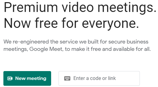
With Google Meet, you click on the dark green “New meeting” button to the far left of the screen to start. While Google’s UI is very familiar to us, the site has a few more steps to starting a new meeting. The button’s not centered, and your eye has to spend a few more seconds wandering the screen to find it.
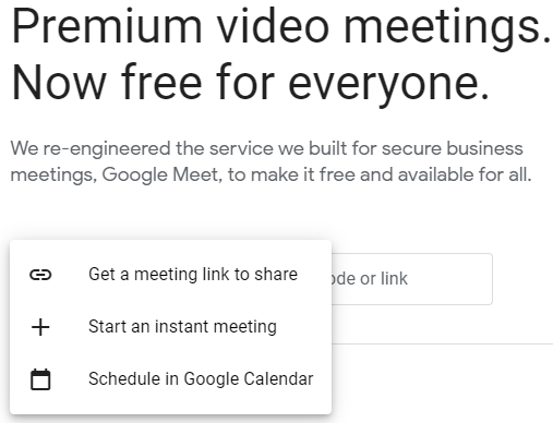
Then, when you click on “New meeting,” you get three options that have busy, equally sized text with no visual distinctions. And if you pick “Start an instant meeting,” you land in a waiting room instead of instantly jumping in!
The fewer clicks or seconds it takes to get the job done in the user journey, the more valuable the product!
Let’s get back and Zoom in on the basic use case of opening up a new meeting! Just to illustrate, I’ll be using Zoom from my desktop, which I use for all things work. (My segment: I’m an investment banker preparing to hold a virtual client meeting in a few hours. I have a basic understanding when it comes to new tech interfaces, but I need to prep with my team on Zoom now so we can smoothly present slides for the client later in the formal session.) This is the job I need to get done as a user.
I. Open up the app from the desktop.
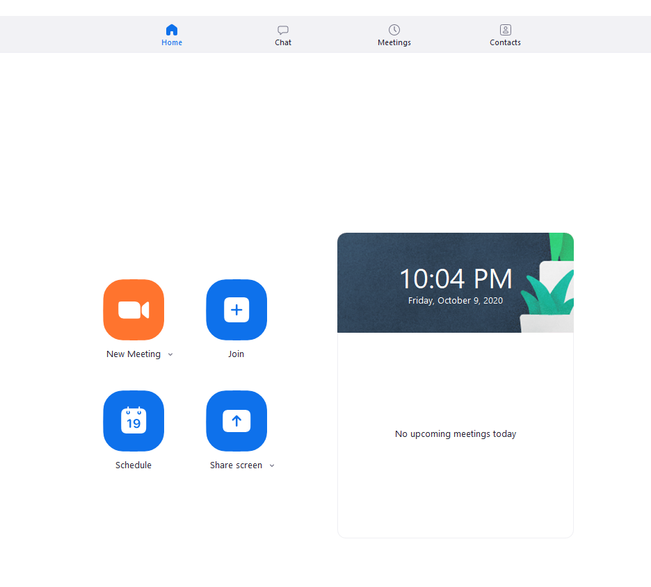
The Good
Crisp, clean interface. Descriptive, spaced out text. Good color, spacing, and icon hierarchy.
I know where I want to go.
Additional perks:
- Integration with Outlook, Google Calendar, and other calendar programs to schedule a future meeting. You can reduce steps by starting in-app!
- It’s not so busy here, so I can easily click the dropdown arrow beside the “New Meeting” button. I can start with video and copy an invite with my personal ID.
All good so far.

II. Click on “New Meeting”
The Gapped
A pesky popup as soon as I try and open up the virtual meeting!
It blocks the user from what they want to accomplish next.
Couldn’t this be a less major option?
For users like my older, less tech-savvy parents looking to video chat with their friends or join in a senior choir rehearsal, this can be a distraction. They’re scratching their heads because when they clicked on “New Meeting,” they expected to immediately be launched into the video chat.
III. Click on “Join with Computer Audio”
The Gapped
…Where do I go next? If I’m a first-time user, I won’t instinctively know where to go, and I’m left sitting awkwardly in a silent room.
Here, prompts would be nice. It turns out that the next action just happens to be hidden in a busy menu with actions I’m not thinking about using right now.
PM Lesson 1: Love your product, but don’t automatically qualify what’s obvious vs. non-obvious in the user journey.
It’s a different ballgame for a PM who’s been deeply involved with the product for months and possibly years on end compared to a user with fresh eyes.

IV. Inviting Participants

The Gapped
The main attraction is hard to find: I don’t have participants in my room yet, but the “Invite” button is prioritized at the same level as “Mute All” and “Unmute All,” which I might find confusing. It’s not in an intuitive position where I can find out what to do next. Some UX hierarchy might help out a lot!
Then, I can send out a standardized invitation to my contacts within Zoom or jump into Gmail and copy-paste a standardized invitation to my coworkers there.
PM Lesson 2: Minimize the mental gymnastics to get from start to finish- it’s at the user’s expense. Point to the next action to keep things going smoothly.

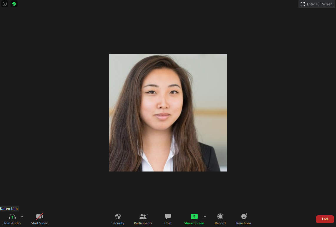
V. Running the Meeting and Closing Zoom
The Mostly Good, Slightly Gapped
The parties are invited, and they’re inbound!
Now comes the easy part, thanks to Zoom: talking to people on the other end of the call. Software company Appcues analyzed the end-to-end process and concluded that
Over 90% of the time on an average Zoom call is spent simply looking at the other person and conversing.
I really like the hierarchy Zoom ran with the general chat process- it’s simple and usually easy for both the moderator and participants to run through.
Sharing is easy to find with the noticeable green button. All I have to do is click it to get to the share menu of the screen/app you want to share with the group (shown to the right).
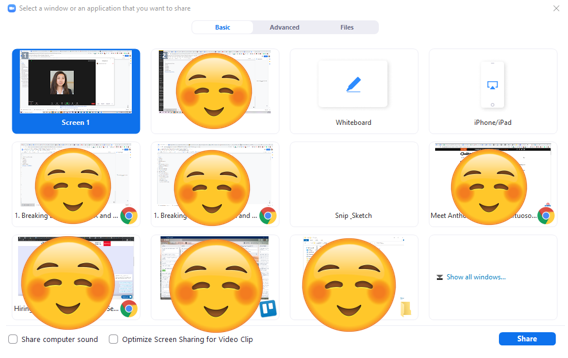
Once I click “Share,” it might be daunting to see all these screen options pop up for a first-time user.
Maybe Zoom could go further into UX hierarchy by icon and font sizes (i.e. clearly distinguishing desktop screens from webpages from apps).
PM Lesson 3: Minimize overloading the user with options whenever possible — or at least make it easier for them to know where to click.

I get a toolbar on the shared screen to pause the share and annotate. Participants can also annotate as they please if they feel like it helps their fellow better understand the slide. Like with PowerPoint or Adobe PDF, I can scroll between slides with the arrow keys, a muscle memory-based, familiar touch, which is a plus!
However, while the buttons I see are easily visible without any text noise, some buttons require me to hover my mouse over them (e.g. “More” and the dropdown arrows by “Mute” and “Start Video”), and others require a click (“Participants”). It can be confusing to the first-time user. The feature toolbox is awesome (such as stopping video, recording, emoting or even muting all participants) — the experience would just be a lot smoother with more in-app guidance and selection type consistency.
PM Lesson 4: Don’t oversimplify to the point where you’re compromising clear user direction.
One thing that could help is to put the red “End” button in a more intuitive place- nice touch on the color selection, though! Because we’re so used to closing browsers with the “x” button, our mouses might hover towards the upper left corner instead of closing out.
PM Lesson 5: Simplicity and muscle memory make a handy behavioral tool that’s easy to use.
It’s crazy how one video conferencing tool has taken the spotlight as a necessity in remote work, even going so far as becoming a regular topic in mainstream memes and a place for tabletop readings.
Kids and beloved pets are making cameos in work or school meetings. The one time you forget your camera’s on and oops! You’re accidentally presenting in front of class in your underwear!
Nevertheless, Zoom isn’t going anywhere anytime soon.
The possibilities (and sometimes your Zoom backgrounds) are endless!
_________________
Zoom offers the benefit of a simplified pathway where you can patch in relatively easily and share materials efficiently.
It gets the job done with less visible fuss or confusion.
Some areas of improvement in the UX would be to simplify even further:
- Add small prompts that guide the user forward to the next action, including inviting participants if you’re in an empty Zoom.
- Move the critical purpose buttons (e.g. “Invite” and “End”) in a more eye-catching space.
- Confuse less, point more!


0 Comments